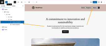
Enhance Your WordPress Navigation Experience
The Responsive Navigation Block is a WordPress plugin designed to optimize navigation menus for different screen sizes. It introduces two distinct variations of the Navigation block—Mobile and Desktop—allowing users to customize their menus based on device type. Users can apply different styles for each navigation and set specific breakpoints for seamless transitions between mobile and desktop views. This enhances user experience by ensuring that navigation is intuitive and visually appealing across devices.
With straightforward installation and activation, this plugin automatically registers the Mobile and Desktop Navigation blocks. Users can easily modify and style their menus in the editor and observe live changes by resizing their browser. The plugin maintains user privacy by not utilizing cookies or sending data to third parties, making it a reliable choice for developers looking to improve website navigation.